|
"It is knowledge that makes the work beautiful." St. Thomas Aquinas
© 2000 Nita Leland
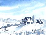
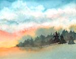
It's easy to get confused about color temperature. The only certainty is that color temperature is relative. When you look at the color wheel, you can see there is a warm side with red, orange and yellow and a cool side with green, blue and violet. The warmest color is a blend of red and orange--red-orange--and the coolest is blue-green. It's pretty easy to see on the color wheel, but when you look at paints, it's sometimes hard to see. Part of the problem is that paints aren't pure spectral colors, so there is no clear standard of comparison of color temperatures. Here's the way I distinguish colors in paints: The closer a color is to red-orange, the warmer it is; the closer to blue-green, the cooler it is. But it really depends on what direction you are going. For example, if I start at red-orange and move continually toward blue-green, then I am always getting cooler. When I go the other way, I'm getting warmer. So if you look at your colors and determine which direction they are going, you should be able to distinguish the color temperatures. The greatest confusion seems to be concerning blue pigments. Blue is recognized as a cool color on the spectrum, however, there are many variations of blue in paints, and some are warmer or cooler than others. One of the few warm blues is French Ultramarine, which leans toward the red side. Cobalt Blue is slightly cooler--has less red in it. The phthalocyanine blues, Antwerp and Prussian Blue are cool blues, leaning toward green. The same is true of Cerulean and Manganese Blue. Once you pass blue-green, however, there is more yellow in the mixture and the color becomes warmer. What is more important is how you use color temperature in your painting. Here are three examples of temperature emphasis. The sketch of Monument Valley emphasizes warm color; the barn scene is cool. The landscape shows how you can use contrasting temperatures to liven up the color.
|