|
By using contrasts effectively, you can create
rich, harmonious color. Master these six principles of contrast and
you'll be on your way to more expressive painting.
Principle
in Action: The Fauvists and modern color-field painters
placed pure hues against each other. Stained glass, mosaics and
Pennsylvania Dutch stencil designs are other good examples of this
principle at work.
Principle
in Action: Renaissance and Mannerist painters used contrasts
in value to give their work a strong visual impact.
Principle
in Action: J.M.W. Turner was a master at using pure,
delicate tints next to low-intensity colors.
HINT: As a rule of thumb, your picture is harmonious when
colors are close in intensity or value, but not both at the
same time; some contrast is necessary in either intensity or value.
Principle
in Action: The Impressionists relied on temperature contrast
rather than value contrast to suggest light. Paul Cezanne used
contrasts in color temperature to manipulate form and space.
HINT: All complementary contrasts are also temperature
contrasts, but not all temperature contrasts are complementary.
For more on Color Contrast, see Exploring Color Revised pp. 30-31.
|
|
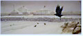
Click the picture
below for an enlarged view. In The Invaders (watercolor on paper, 17 3/4 x 40 1/4),
Homer O. Hacker has created a striking contrast by placing bold
black crows against a high-key background. By avoiding strong
contrasts in the background and by repeating the smaller black
shapes of additional birds, he controls where the viewer's eye goes
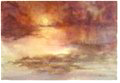
and leads it back to his focal point. Click the picture
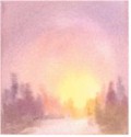
below for an enlarged view. By surrounding pure yellow light with veils of muted scarlets,
blues and violets in Radiance (watercolor on paper, 15 x 22),
I used the principle of intensity contrast to let the color
glow.
This article has appeared on the Watercolor Magic web site.
|
 1. Let's start by looking at the contrast of
pure hue. When you put pure, bright colors next to each other,
they won't clash no matter how many you use or how you combine them.
That's why children's and primitive artists' works are usually so
vibrant and exciting. Bright colors express high energy and emotion.
1. Let's start by looking at the contrast of
pure hue. When you put pure, bright colors next to each other,
they won't clash no matter how many you use or how you combine them.
That's why children's and primitive artists' works are usually so
vibrant and exciting. Bright colors express high energy and emotion.
 2. Value contrast sets the tone for
color expression. Full-contrast artwork has a complete range of
values, from white through midtones to dark, and suggests normal
illumination. Middle values usually provide the framework for value
painting, with light and dark value contrast giving the work its
visual impact. High-key colors, the tints and middle tones at the
light end of the value scale, are usually pure colors and convey a
feeling of soft, harmonious ambient light. Artwork using high-key
color is cheerful and optimistic. Low-key colors in middle to dark
values indicate dim illumination, and create a serious, pensive
mood.
2. Value contrast sets the tone for
color expression. Full-contrast artwork has a complete range of
values, from white through midtones to dark, and suggests normal
illumination. Middle values usually provide the framework for value
painting, with light and dark value contrast giving the work its
visual impact. High-key colors, the tints and middle tones at the
light end of the value scale, are usually pure colors and convey a
feeling of soft, harmonious ambient light. Artwork using high-key
color is cheerful and optimistic. Low-key colors in middle to dark
values indicate dim illumination, and create a serious, pensive
mood.
 3. Intensity contrast comes from placing
pure, bright color within areas of grayer, low-intensity color.
Bright colors or pure tints surrounded by a field of neutrals sing,
especially when the hues are complementary. For example, red seems
much brighter when the gray next to it is tinged with green.
3. Intensity contrast comes from placing
pure, bright color within areas of grayer, low-intensity color.
Bright colors or pure tints surrounded by a field of neutrals sing,
especially when the hues are complementary. For example, red seems
much brighter when the gray next to it is tinged with green.
 4. Complementary contrast means placing
colors opposite each other on the color wheel next to each other in
your painting. When the colors are both intense, the effect is
electric. When one is bright and the other muted, the bright one
sings.
4. Complementary contrast means placing
colors opposite each other on the color wheel next to each other in
your painting. When the colors are both intense, the effect is
electric. When one is bright and the other muted, the bright one
sings.
 5. With temperature contrast, warm and
cool colors work together to create a sense of movement: warm colors
advancing and cool colors receding. Radiance emanates from artwork
with predominantly warm colors. When a cool temperature dominates,
warm contrasts keep the piece from seeming unpleasantly chilly.
5. With temperature contrast, warm and
cool colors work together to create a sense of movement: warm colors
advancing and cool colors receding. Radiance emanates from artwork
with predominantly warm colors. When a cool temperature dominates,
warm contrasts keep the piece from seeming unpleasantly chilly.
 6. Size contrast refers to the relative area or
quantity of a color. A large area of color makes a strong statement,
but many small areas of color, especially if they are very intense
and surrounded by a large area of lower intensity, can create energy
and movement. But beware, pure color can be overwhelming, so when
the large area is lower in intensity, even small bits of color
within it appear brighter than usual.
6. Size contrast refers to the relative area or
quantity of a color. A large area of color makes a strong statement,
but many small areas of color, especially if they are very intense
and surrounded by a large area of lower intensity, can create energy
and movement. But beware, pure color can be overwhelming, so when
the large area is lower in intensity, even small bits of color
within it appear brighter than usual.